In our digital age, advertising has moved more and more into the digital realm. But we can’t deny the still constant presence of visual advertising in the real world, and the principles behind what makes for attractive signage are still constant. As one of the top Idaho Falls sign companies, IF Signs wants to share some insights we’ve gained over the years to help new businesses get a better idea of what makes for an attractive sign.
High Contrast For Readability
 While driving, people have a short window of opportunity to take in the message of a sign.
Think about all of the factors you’re dealing with while you drive, both inside and outside of the car, that are competing for your competition.
With this in mind, it should be obvious that your sign should be not only eye-catching but easily readable as well.
The way to accomplish this is, first and foremost, with contrast.
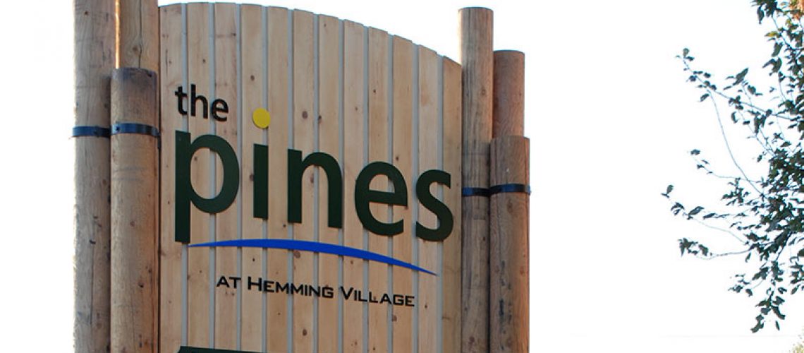
Most signs for businesses include text and graphics in the foreground with a continuous background color. This is because the viewer needs to be able to quickly read and retain the information, understanding that it’s all within a specific context.
This is where contrast is most important—think of a bright color set against a dark background. For that matter, you could have the opposite and the effect would be the same.
You won’t see many Idaho Falls signs with weak color contrast, and if you do, it’s only because different elements have been highly strengthened or enhanced with a prominent outline or shadow effect.
Eye-Catching Colors
 According to CEO Today Magazine, 80 percent of the recognizability of a trademark is due to its color.
Think of some of the most popular business logos or color schemes and you’ll notice a pattern: McDonald’s yellow, Coke red, Starbucks green.
These are prominent colors that catch your attention, as they are typically contrasted with the surrounding colors of both the city and the natural environment.
That said, you need to consider your business’s “personality”, as well as your target audience—law firms that use more muted and mellow colors, are going to be taken more seriously than ones that try to look like McDonald’s, after all. The good news is that variations of these colors can still be used in a bold and eye-catching way, as these law office signs show.
Sizing Up Your Signage
You’ll notice most Idaho Falls signs, at least the ones on the roadside, are pretty big. This is because successful companies typically use a simple rule of thumb: About 10 feet per inch of letter height.
In other words, a sign with a letter height of ten inches would probably have the most impact at a distance of 100 feet.
The Right Font For Your Business
 This is where you may find yourself riding a thin line between a font that best represents your business and that which is easiest to read at a distance.
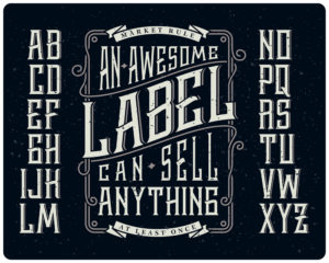
It’s important to not use more than one font throughout your sign, and crucial that the font for your business name is uniform.
So, how do you make the best signs in Idaho Falls for your business? This of course depends on what kind of business you own. For instance, Comic Sans Serif gives a lighthearted impression, whereas Times New Roman looks more old-fashioned and official.
Go here for more information on how different types of fonts convey different impressions.
Looking For Idaho Falls Sign Companies To Help You Advertise? Choose IF Signs
We can help you design anything you need, from banners and displays to roadside signs and more!
We also offer vehicle wraps so you can turn your vehicle into a mobile advertisement for your business.
Getting started is easy. Simply give us a call and we can get you an appointment. Bring in the images you would like turned into a custom sign and we can get started on creating it.
We don’t only create your signage, we can also place it as well. That’s right—we’ll do the heavy lifting.
We are located in Idaho Falls but also offer services in Rexburg, Blackfoot, and Pocatello.
Fill out the form below and we’ll be in touch!

